Form design best practices
When to align labels to the left, right or top
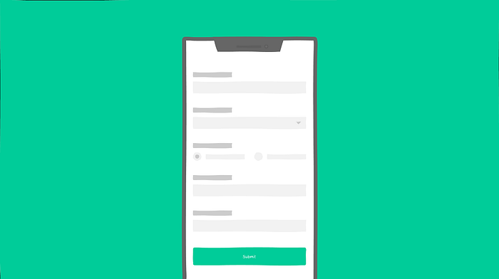
Forms are one of the most important components of any digital design. Designing a form seems straightforward and easy, but it takes some time and science to master it. Out of various factors to be considered while designing an effective form, this short article focusses on labels and how to align them with their respective input fields.
Though it seems like a very small decision about aligning a text, it has a direct impact on the usability of entire form. There are 3 practices people follow while aligning the labels.
- Inline label : aligned to left
- Inline label : aligned to right
- Label aligned to top
Lets try to understand pros and cons of positioning label in three different scenarios individually
1. Inline Label : Aligned to Left
When we align labels to the left, there is inconsistent spacing between label and input boxes across different input fields. So white space is not a problem, the excessive visual distance between label and the input fields is. Because of this, form unnecessarily demands more time and attention from the user, thereby resulting into slower form completion rates. Also, they take more horizontal space on the page; not very good option for small screen designs.
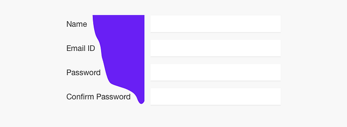
Looking up on the bright side, we can use this aspect to slow down the users purposefully while filling up form with important data like medical claim forms, passport applications or vehicle registrations etc. There are other ways to slow down, but this is how we can make use of labels. Also, if the form is long, then aligning labels inline helps reduce the vertical height of the form.
2. Inline Label : Aligned to Right
When we align labels to the right, the visual distance between the labels and their respective fields is consistent across the form. This creates stronger association because objects placed close to each other seem related (Law of Proximity from Gestalt principles of grouping). But, right aligned labels run a risk of inconsistent space on the left hand side. Since there is no hard left edge in the form, it results in creating some discomfort and makes scanning of the fields a bit difficult. Eventually, results into slower completion of lengthy forms.
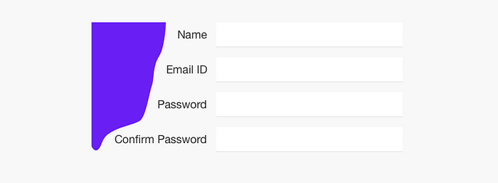
As we see, right aligned labels showcase much improved usability as compared to left aligned labels. So if we have to make a choice to align a label inline, go for right aligned labels.
3. Labels Aligned to Top
Besides aesthetically better looking, there are lot of other benefits of keeping label above the field.
They have least visual distance between label and the input fields. So from a cognitive point of view, the association is very strong and response is faster since users comparatively take less time mapping labels with the fields. Also the eyes move only in one direction since the scanning is top down as compared to Z shape (left-right and top-bottom) for inline labels.
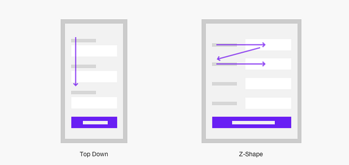
Design is space efficient and hence adaptable to all resolutions; In short, responsive in nature. We only need to take care about input field widths. We also get flexibility in regards with length of labels. This proves useful while working with variable label lengths like multilingual support for applications.
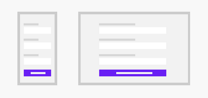
Moreover, extra space on right can be effectively used for providing assistive information or actions.

The only drawback of this approach is the increase in height of the form. However, it can be countered with alternate designs like grouping of fields or stepper forms or even wizards if applicable. In all other cases, aligning labels on top works the best.
Placeholder Text
Placeholder text is not actually an input field label, but since we are on the topic, let us discuss how this works. As good as it looks, this practice is very space efficient; But, there is a caveat. Once user enters a value, placeholder text disappears and so the user may get lost while filling up the form. Also good visual treatment is very essential to avoid confusing placeholder text with the entered information.
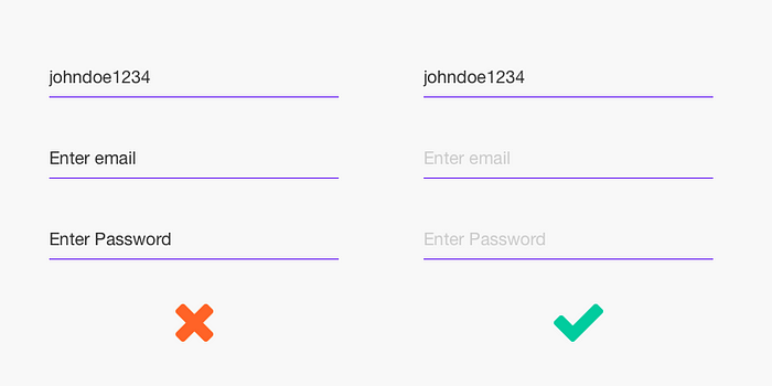
However, it is not difficult to solve the problem. Simple floating label on input enables user to check the data he is filling. While implementing, it is very important to pay attention to the spacing between consecutive input fields to avoid confusion (Law of Proximity from Gestalt principles of grouping) and create stronger association between labels and input fields.

Conclusion
Positioning and aligning of labels is one of many aspects of effective form designing. There is really no hard and fast rule for aligning labels while designing forms. As we saw, simple things like alignments play a huge role in the Creative Process of Design. There is so much we designers can influence just by understanding the context we design for.
👏 If you enjoyed reading my article. Follow me for more of such articles. Tell me, what else would you like me to write about.
Leave your comments to start a discussion. You can also reach me on my Instagram or Twitter
